Excitement for the surprise Steam release of Chrono Trigger quickly turned into dread today as fans realised that this port, like most of Square Enix’s PC ports, looks like garbage. Why has Square had such a hard time getting this right?
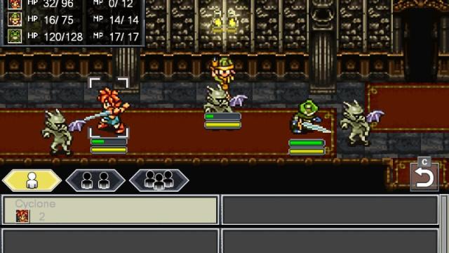
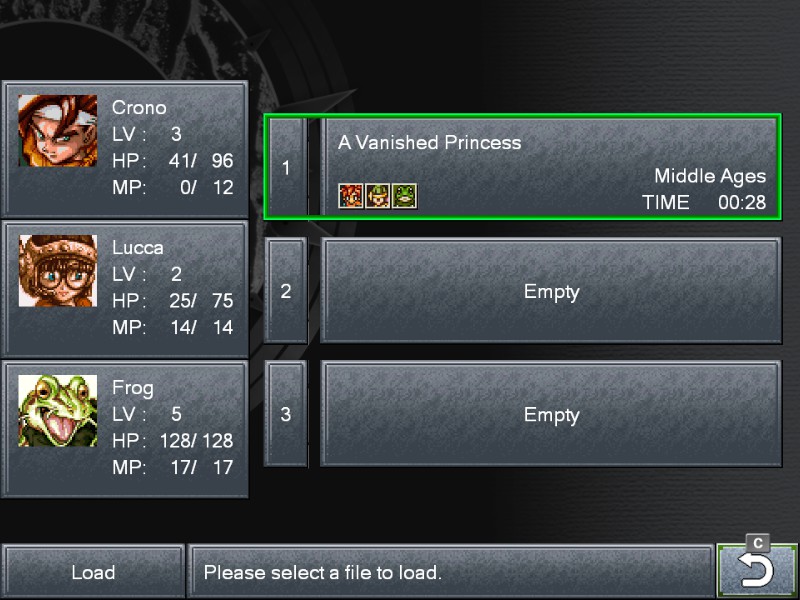
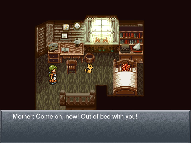
No, Square Enix hasn’t replaced all of the character models with washed-out sprites as the company did for Final Fantasy 5 and Final Fantasy 6. But this is a straight port of the mobile version of Chrono Trigger, and the developers didn’t alter the user interface or font, leading to hideous results:
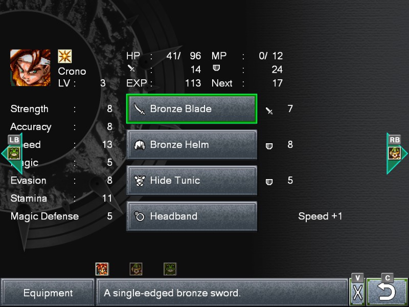
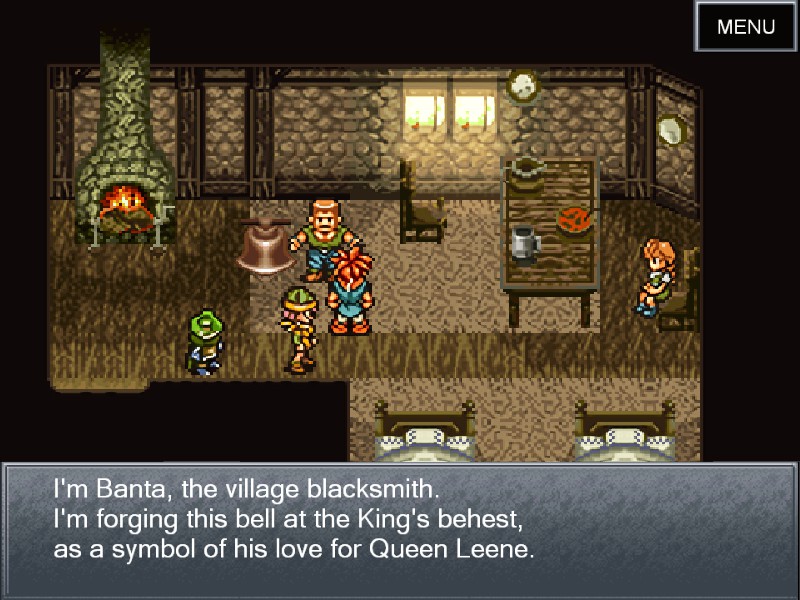
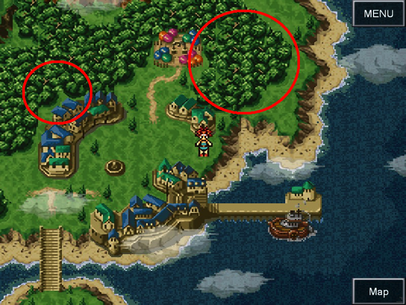
Just like with Final Fantasy 5, this port of Chrono Trigger even has tiling errors. You can actually see the little square tiles on the map because they don’t align properly, as shown in this screenshot (red circles added, obviously):
It’s all a disaster, and it’s possible that Square Enix isn’t even aware that fans have problems with it. In September of last year, when I brought up the FF5 and FF6 ports to veteran Final Fantasy producer Yoshinori Kitase, he seemed surprised that North American fans had a problem.
“I am actually curious to know – I believe the port version, the one you can get right now, does use the more brushed up artwork that’s a little bit more refined,” he said. “Do fans want to see the older version that’s not as refined? Is that the sentiment?”
Hopefully they get the message that this kind of port isn’t going to please many people, either. I asked Square Enix why they chose to go down this route instead of tweaking the user interface to feel more like a PC game or emulating the SNES version, but the company has not responded. For now, you may want to stick to Chrono Trigger on DS.
Comments
23 responses to “Oh No, Chrono Trigger Looks Awful On PC”
Release the same title without any update = cashgrab and lazy
Release the same title with some modern graphical update = you are destroying the retro feel
??
I don’t really know what the author is complaining about. The game and its font looks fine to me. It’s legible. That’s all I care about.
The screenshots don’t really do the awful filter justice. It makes all the pixels look like they’re bulging into eachother, rather than the crisp pixels the game is supposed to have. And god that font, is that arial? Plenty of screenshots on Google of how it should look: https://www.google.com.au/search?q=chrono+trigger+text&tbm=isch
Yeah same. I looked at the screenshots, and I don’t quite get what people are so upset about. But my only memories of Chrono Trigger are playing it on a SNES emulator and the DS.
Honestly, I would have never even noticed the tiles thing.
Could someone explain the concern with the font?
Same here. I mean, it’s not pretty, it’s certainly not Persona 5 in the UI stakes, but it looks functional enough to me.
It’s kind of one of those subtle aesthetics things and difficult for me to explain. Basically it’s sort of the equivalent of removing some text in like a newspaper and then replacing it with something written in Comic Sans and in a size slightly too big and with different kerning.
I think mainly it’s the fact that the text was originally monospace so when you change it, it looks different if you don’t change the text area to suit.
It’s worse in motion. I didn’t realise the tiling thing until I upgraded my ipad version of it this morning. It’s not good. Definitely not unplayable though.
They destroy the look regardless of nostalgia goggles. I was never a huge fan of Chrono Trigger (never ran across it in my early years) but when I look at those shots all I think is how badly those old pixel sprites clash with the clean looking modern UI. The two styles don’t mesh at all. It’s seems like they’ve replaced assets with modern equivalents that scale more easily to a phone screen without care for how badly it clashes with the style of the game.
Generally speaking, it’s becoming much more obvious that far from being lazy, preserving the original look of old games on news systems is becoming increasingly difficult.
There are some games done well in the modernising, yet keeping the old game there.
The best example is Wonder Boy The Dragon’s Trap, which literally was built over the old game.
https://gaminghistory101.files.wordpress.com/2017/06/wonder_boy_the_dragons_trap_compare.jpg
It also let you switch between new and old graphics on the fly and the audio too if i remember right.
I wish Square would do more like this instead of either poorly done 3D or straight port.
Remake the sprites to be new and nice, that kind of thing
It’s like Chrono Trigger has been a sex tourist that caught AIDS in the time since it visited the DS.
The real question is, why is Frog at Lv 5 and Crono only at Lv 3?
Time travel?
Huh? didn’t Jason make an article literally 2 hours ago saying the best thing about CT is that they haven’t changed the graphics from the mobile version? Confused 😛
Yeah, but he was specifically referring to the lack of crappy sprites, as per the FF5/FF6 ports. He probably was only going off the promotional shots at that stage, which don’t show the UI and the filter isn’t obvious.
We’ve got to the stage were remastering 16-bit games require much more work than they used to. Unless you put in a lot of effort, things can look really disappointing really fast.
Honestly, doing something creative to the art like what Lizardcube did for Wonderboy last year is starting to become the only (expensive) option left for developers if they don’t want to disappoint fans.
Saw a YouTube vid the other day on why mastering Diablo 2 for modern PC’s would be very hard to do so it doesn’t surprise me. It came from one of the original heads of programming, cant remember his name.
Short story with D2 was that because we use 16:9 (or bigger) instead of 4:3 screens many of the tricks they use to trigger events just wouldn’t work these days. Fixing that would break other things, like pathing, and fixing that would break something else, and so on. In the end, it meant it would be surprisingly hard to remaster D2 for the modern PC.
It doesn’t seem like much, but with the tricks and shortcuts used by programmers, a simple change of color of a sprite could have long lasting effects throughout the rest of the game.
So yeah, it does look like remastering has reached a point where it requires far more work than people think, and easy to get wrong.
Considering that running it through a SNES emulator gets amazing results always makes me question stuff like this.
Add on that I’m more than certain die-hard fans would be more than eager to help do modern style graphics if that were an issue, at no cost. Like, you could probably just google and find a tonne right now already.
@jason be sure to cover the fan-made HD mod when they release it.
What I don’t get is how someone like Squeenix with all their history and resources can make a UI that looks like it came straight from the 90’s. The juxtaposition of SNES era visuals and modern elements is also jarring. They could have at least tried to make the modernisations fit stylistically rather than slapping them over the top.
SNES resolution was (at max) 512 x 448. Making that look decent on 1920 x 1080 wouldn’t necessarily be easy – see my post directly above. Changing one thing from the original source code can easily break something else, and a lot of that can be tied to the display resolution versus doing stuff just off screen.
Then if they change too much, people start wondering if it should be considered the same game at all. End of the day, making these things work is a lot harder than most of us realise.
Wonderboy 3 was the correct way to do a remake I feel. Entirely fresh look/feel to it but at it’s core it’s the same game I friggen loved as a kid. The way Square is doing these games these days is lazy AF. You can get the exact same look for free simply by getting a SNES emulator and putting 1 of those filters on as you play the rom.
The Secret of Mana remake is a different matter though. Horrific english voice acting aside, at least they attempted to do something neat with it. How well they did though depends on the person playing it since I consider SoM in the top 3 games of all time, and I personally like the remake even though the graphical choice is a little weird. Though truth be told I would of preferred they released that Seiken Densetsu collection for the switch instead.
Yeah, the fonts are ugly but are (hopefully) moddable so that they look better.
I wonder, wouldn’t it have been easier for them to just give us the ROM and an emulator? I mean that’s what they did for the early Sega games on Steam.
and largely how dosbox games work.