It’s that time that comes but once every seven years when we approach a new console with joy, eager to learn its secrets and idiosyncrasies. Part of that process is learning to love a new menu system, which has the power to shape how we perceive this new device in big and important ways.
So, dear reader, let’s go forth and compare the old with the new to see how things have been improved, and which things might need to be turned off.
Let’s start with the easy one.
What’s New With The Xbox Series X|S Menus
Nothing, really. There are some extra gaps and some of the little boxes are shifted about 0.5cm away from where they were before, but during the set up process the app wholesale transferred over all my old settings, so even the background was the same, which made my shiny new console instantly feel old and worn.

On the one hand, this was good, because it meant I could just jump in and start playing. On the other hand, where’s the fun in repeating the exact same experience I just tolerated for years? I don’t hate the menus because I’m used to them, and they work fine, but it was hardly a clean interface, even if it was vaguely intuitive. Xbox is all about backwards compatibility and letting you bring the old stuff to play with the new stuff, but this is one example of recycling we could have done without.
What’s New With The PS5 Menus
This is where things get interesting, and we really get to feel like the old console now looks like an outdated piece of junk in comparison. This is what you want to justify the money, and is why their graphic designers should have been paid the medium-to-large bucks.

It’s essentially the same experience, but the font and default background are different, the PS5 menu music is new, and it just altogether feels more premium and updated. This is a console for 2020, and now when I go back to the PS4 it immediately shows its age.


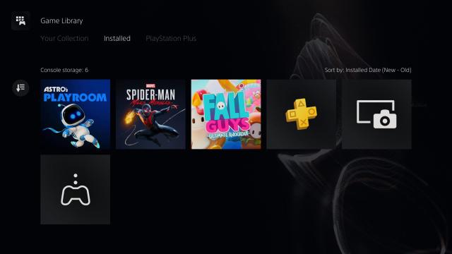
Other places like the game library have also been given a touch up.

These tweaks are relatively minor, but really elevate the experience to feel new, different and, well, better.


As you can see, everything in the settings menus are laid out nicely, and in a way that makes sense, without adding unnecessary blocks or colour.
Where things change the most in the experience is in how you turn off the console.


Whereas before you had to hold down the PS button for a second or two to get a big, ugly power menu, things are now more subtle. One, quick press of the PS button will get you a small menu at the bottom of the game which allows you to switch users, change settings, adjust the music, read some news and turn off the console. Unfortunately you can’t take a screenshot with the menu in it, but you get the idea from these photos.

A long press of the PS Button now takes you back to the home screen.
There are some other PS5 menus, like the entertainment apps, Store, PS Plus, PS Now and photos and video section that I’m not allowed to show you yet because of embargos, but you get the gist from these ones that a better experience awaits those who were lucky enough to preorder.
Leave a Reply